Color Psychology in Home Decor: Enhance Mood and Function Room by Room
Discover the power of color in transforming your home! This guide explores how color choices can affect mood, energy, and functionality in each room. From calming hues in the bedroom to energizing tones in the kitchen, learn how to use color psychology to create spaces that feel harmonious and perfectly suited to their purpose. Elevate your home decor with intentional, mood-enhancing color choices tailored to every area of your home.
11/12/202411 min read
Color Psychology in Home Decor: Enhance Mood and Function Room by Room
Colors play a pivotal role in transforming the mood and atmosphere of a home. They can influence emotions and energy levels, making the right color choice essential for each room's purpose and vibe. Understanding color psychology can help homeowners create spaces tailored to relaxation, productivity, or socializing.
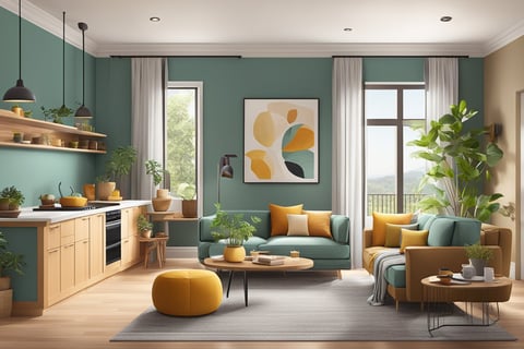
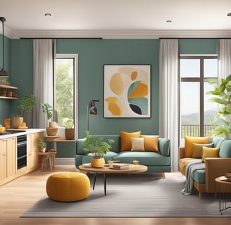
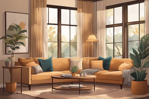
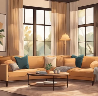
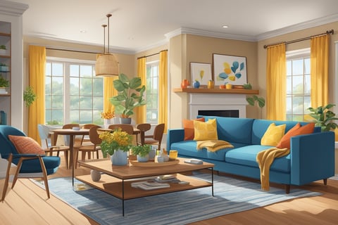
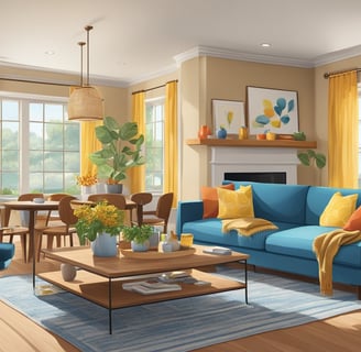
In living rooms, warm tones like soft yellows or muted reds encourage conversation and warmth. For a calming bedroom retreat, consider soothing blues or greens that promote serenity and restfulness. Energizing colors like vibrant oranges or deep purples may work well in spaces designed for creativity or exercise, such as home offices or gyms.
Kitchens often benefit from stimulating hues that promote appetite and energy, such as shades of red or orange. Bathrooms can become spa-like with cool colors, embracing tranquility and cleanliness, using whites, light blues, or soft grays. By aligning color choices with both personal preferences and room functions, inhabitants can enhance their living spaces' harmony and effectiveness.
The Impact of Color on Mood and Atmosphere
Color significantly influences the ambiance of a space and can alter emotional responses. Choosing appropriate colors for different environments can enhance comfort, productivity, or relaxation.
Psychological Effects of Color
Colors can evoke various emotional responses. Red often increases energy levels and passion, while bluecan induce calm and peace by lowering blood pressure and heart rate. Green is typically associated with tranquility and renewal, making it ideal for places of rest. In contrast, yellow is linked to happiness and can boost energy but may also lead to frustration if overused. Purple often signifies luxury and can stimulate creativity. Understanding these effects helps in selecting the right color for each room's function.
Color Theory Basics
Color theory involves the use of the color wheel and the relationship between colors. Primary colors (red, blue, and yellow) form the base, and secondary colors (green, orange, and purple) come from mixing these primaries. Tertiary colors result from mixing primary and secondary colors, creating combinations like teal or magenta. Warm colors like red and orange can raise energy levels, while cool colors such as blue and green are relaxing. Neutral colors (black, white, gray) balance other colors, providing versatility in décor.
Color and Emotional Well-Being
Colors impact emotional well-being by influencing mood and stress. Soft hues like pastels can reduce stress, promoting a sense of calm, while vibrant colors may energize but also increase anxiety in certain settings. Earth tones like browns and greens offer stability, grounding the atmosphere. Selecting colors that align with the intended emotional experience can improve mental health and personal satisfaction within a space. Carefully integrating colors can create environments that feel inviting, safe, and visually pleasing.
Room-by-Room Color Guide
Each room in a home serves unique functions, so it's essential to choose colors that complement these roles. For instance, the living room benefits from warm tones, while calming hues are ideal for bedrooms. Kitchens can appear fresh and inviting with bright colors, and bathrooms often feel serene with cool tones.
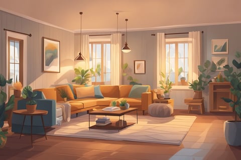
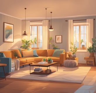
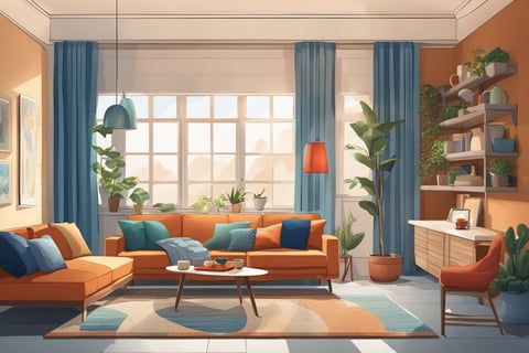
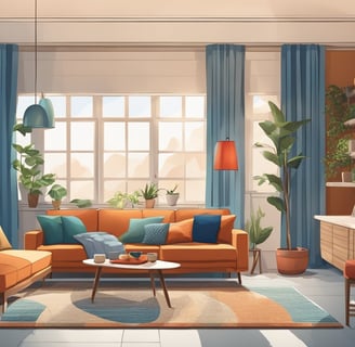
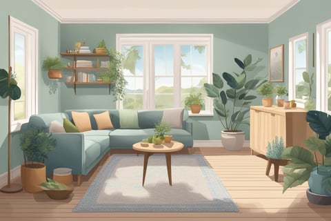
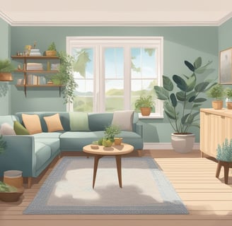
Living Room Colors
The living room is a focal point for social gatherings and relaxation. Warm colors like earthy browns, soft oranges, or muted yellows can create a welcoming, cozy atmosphere. They promote conversation and closeness among guests.
Accent walls in rich, darker shades can add depth, while lighter tones help the space feel larger and more open. Consider using a neutral base to provide balance, allowing for easy updates with accessories or textiles.
Kitchen Colors
Kitchens thrive with lively and energizing colors. Fresh greens and vibrant reds can stimulate appetite and conversation. Yellow is known to encourage happiness, making it an excellent choice for kitchen spaces.
Combining these with white or light neutral cabinets ensures a clean, modern look. Accent tiles can introduce subtle patterns or additional colors to personalize the space. This approach not only enhances aesthetic appeal but also encourages an inviting, warm environment.
Bedroom Colors
A bedroom should be a sanctuary for rest and relaxation. Soft blues, gentle greens, or pale lavenders create calming environments conducive to winding down. These colors promote sleep and tranquility.
Rich, darker tones, such as deep purples or soothing grays, can offer a sense of luxury and comfort. Pairing these with plush textures, such as velvet throws or silky drapes, enhances the cozy, inviting nature of the room.
Bathroom Colors
Bathrooms often benefit from colors that promote cleanliness and relaxation. Cool shades, such as aqua, sky blue, or seafoam green, evoke a sense of calm and refreshment, much like a spa environment. These tones help create a serene and refreshing atmosphere.
Light neutrals like off-white or light gray can enhance natural light, making small spaces feel roomier. Opting for monochromatic tile designs can add sophistication and continuity to the design, maintaining a crisp, polished appearance.
Dining Room Colors
Dining rooms aim to create a formal yet engaging setting. Rich reds, deep burgundies, and warm terracottas can enhance intimacy and stimulate appetite. These colors create a robust and inviting atmosphere, making meals feel more substantial and enjoyable.
To avoid overwhelming, balance with neutrals like white or taupe on trim and accessories. Incorporating accents such as patterned runners or vibrant centerpieces can introduce texture and mild contrasts, elevating the room's overall aesthetic without overpowering it.
Home Office Colors
A home office needs to balance productivity and comfort. Cool shades like soft blue or gentle green foster focus and calmness. These colors are conducive to concentration and stress reduction, helping to maintain a productive environment.
Warm hues, such as mellow oranges or muted yellows, can foster motivation and creativity. Combining these with neutral furnishings keeps the space grounded, while personal touches like art or plants enhance inspiration and well-being.
Choosing the Right Colors for Your Home
Selecting colors for different rooms involves balancing the room's function, lighting conditions, size considerations, and color harmonization strategies. Each factor plays a vital role in creating an environment that aligns with your lifestyle and aesthetic preferences.
Assessing the Room's Function
The primary function of a room should dictate its color scheme. In living rooms or kitchens where social activities are common, warm colors like yellows or oranges can encourage interaction and energy. For bedrooms, calming shades such as soft blues or greens may enhance relaxation and promote restfulness.
Bathrooms and home offices benefit from cool and fresh tones, which can foster a sense of cleanliness and focus respectively. Aligning color choices with the room’s purpose helps create a space that meets its intended use effectively.
Considering Lighting and Size
Both natural and artificial lighting significantly impact how colors are perceived. A room with ample sunlight can handle darker shades, as the light offsets them, while rooms with limited natural light might feel larger and brighter with lighter color palettes.
Size plays an equally important role. Light colors make smaller spaces feel more open and airy, whereas deeper tones can add coziness to more spacious rooms. Balancing these elements can enhance the ambience of any room significantly.
Color Coordination Strategies
Successful color coordination involves selecting hues that work well both within a room and throughout the house. A monochromatic scheme offers a uniform look, with varying shades of the same color bringing depth. Complementary colors, like blue and orange, can create a vibrant contrast without clashing.
Analogous colors, those next to each other on the color wheel, such as green and blue, provide a harmonious flow. Utilizing color swatches and samples to test combinations can help in decision-making. Keeping these strategies in mind ensures a cohesive aesthetic throughout the home.
Color Trends in Home Decor
Current color trends in home decor bring a fresh perspective to interior design, with a focus on both nostalgia and innovation. Homeowners are increasingly embracing colors that reflect personal style while staying in tune with contemporary aesthetics.
Analyzing Current Color Trends
Current trends in home decor emphasize versatility and individuality. Earthy tones like terracotta, ochre, and olive green are popular, providing a calming and grounded atmosphere. Warm, muted pastels such as blush pink and soft lavender offer a subtle, comforting touch.
Neutrals remain a staple, with gray and beige evolving into "greige," providing a sophisticated backdrop for any room. Jewel tones, such as deep emerald and navy, add a sense of luxury and depth, transforming a space into a sanctuary of elegance.
These trends reflect a shift towards palettes that promote tranquility and balance, appealing to those seeking refuge from the outside world. Incorporating these contemporary colors thoughtfully can transform a home's ambiance significantly.
Historical Color Trends and Their Effects
Historically, color trends have mirrored societal changes and cultural shifts. The 1970s favored rich, vibrant hues like avocado green and harvest gold, reflecting bold individuality. The 1980s saw a move toward pastels such as mauve and peach, conveying optimism and modernity.
The minimalism of the 1990s ushered in a palette of whites and grays, emphasizing simplicity and clean lines. The early 2000s blended earthy tones with pops of vibrant color, showcasing a blend of traditional and modern styles.
These trends highlight shifts in preferences and technological advancements in paint production. They have influenced how color is used in creating atmospheres, aligning with the emotional and functional needs of each era.
Incorporating Trendy Colors Wisely
Adopting trendy colors in home decor requires balance. Mixing classics with trends ensures longevity and relevance. For instance, use trendy colors as accents, like cushions or artwork, to update without overwhelming.
Consider the function of the room when selecting colors. Kitchens benefit from vibrant, energetic hues like sunny yellows or refreshing greens, while bedrooms may thrive with soothing blues and soft pinks. Pairing neutrals with trendier shades offers a versatile solution.
Being strategic in incorporating these colors ensures that spaces remain stylish yet enduring, accommodating personal tastes while staying fresh and appealing.
Practical Tips for Implementing Color Psychology
Understanding how color choices can transform a room’s energy is vital. Thoughtful combinations enhance mood while fulfilling functional needs.
Choosing a Color Palette
Selecting a cohesive color palette sets the foundation for any room. Begin by considering the room’s purpose. Warm colors like reds and oranges can energize spaces such as kitchens or home gyms. In contrast, cooler tones like blues and greens create relaxation, making them ideal for bedrooms or offices.
A color wheel can guide complementary choices, ensuring harmony. Limit the palette to three or four main colors to maintain a balanced look. Incorporate different shades or tints of these colors for variety without overwhelming the space.
Consider natural and artificial lighting, as it can alter how colors appear. Preview paint samples at different times of day to choose the best option.
Balancing Bold Colors
Incorporating bold colors can bring vibrancy to a room but requires careful consideration to avoid overwhelming the space. Accent walls in bold shades like deep blue or rich plum can offer a striking visual anchor.
Balance bold choices with neutral furnishings or muted accessories, maintaining visual equilibrium. If larger areas use bold colors, opt for minimalist décor to prevent clutter.
Using bold colors in smaller doses on accessories like cushions or vases can inject personality without dominating. This method allows for flexibility in updates or changes. Always keep continuity in mind, ensuring that bold choices resonate with the overall theme of the home.
Using Neutral Colors Effectively
Neutral colors are versatile and timeless, offering an ideal backdrop in any room. Shades like beige, gray, and white provide a sense of calm and elegance, suitable for shared spaces like living rooms or dining areas.
Layering neutrals with different textures such as linens, woods, and metals can add depth. This approach keeps the space from feeling flat.
Add pops of color through accents like art, rugs, or plants to enliven neutral spaces. Consider the undertones of neutrals, such as warm or cool hues, to match the desired atmosphere and existing color schemes. Neutral colors can adapt to evolve with style changes over time, ensuring lasting appeal.
Color Psychology for Small Spaces
Color plays a significant role in how small spaces are perceived, impacting their visual size and overall feel. Using certain hues can open up these areas or create focal points that enhance their charm and functionality.
Expanding Spaces with Color
To make a small area appear larger, light colors are often recommended. Shades like cool blues, soft greys, and crisp whites can reflect light, giving a spacious illusion. These colors enhance natural light, making rooms appear open and airy.
Incorporating mirrors alongside these light hues can amplify the effect. When walls, ceilings, and flooring are kept in lighter shades, it creates a seamless space, diminishing boundaries. Minimal contrastsbetween colors can further support this sense of openness.
Using monochromatic schemes, where variations of a single color are used throughout, can prevent visual clutter. Textures can be introduced in décor items to add personality without overwhelming the space, maintaining the illusion of expansiveness.
Creating Focus with Color Accents
In contrast, small spaces can benefit from color accents that create interest and personality. It's crucial to select bold but complementary colors that serve as highlights against largely neutral backgrounds.
Features like a single accent wall, vibrant furniture pieces, or colorful art can define focus, drawing the eye and adding depth. Strategic placements of these accents are key—positions opposite windows can help keep the room luminous.
Balance is essential when introducing accent colors. Consider the room's purpose and the mood you aim to evoke. For instance, a splash of energizing red or orange in a living area might add warmth, while cool pastels in a bedroom can retain serenity without monotony.
Overcoming Color Selection Challenges
Choosing the right colors for home decor can be a daunting task. By understanding personal preferences and addressing common color commitment issues, individuals can make confident decisions that enhance their living spaces.
Navigating Personal Preferences and Trends
Navigating the interplay between personal style and current trends poses a common challenge in color selection. While trends can offer exciting new ideas, they may not always align with individual tastes or long-term satisfaction.
Tip: It's advised to start by evaluating personal preferences. Creating a mood board using online tools or apps helps capture colors and themes that resonate.
Strategy: Balance is key. Incorporate a few trend elements while ensuring the primary color palette reflects personal comfort and style. This approach avoids the risk of a quickly dated look.
Color selection should ultimately reflect the character and comfort of those living within the space. Sticking with colors that elicit positive feelings ensures a harmonious and lasting environment.
Dealing with Color Commitment Issues
Committing to a color can feel intimidating, especially considering the time and cost involved. Worry about making the wrong choice often leads to indecision.
Step-by-step approach: Test small samples of paint or fabric before making any permanent changes. Many stores offer sample sizes that provide an opportunity to see the color in different lights and times of day.
Practical tip: Utilize temporary decor elements like pillows or artwork as test effects for potential colors. This technique allows for flexibility and experimentation without full commitment.
Seeking professional guidance or using virtual room simulations can also aid in making informed choices. These resources offer insights and reduce the fear of costly mistakes.
Final Considerations for Color Selection
When selecting colors for home decor, the interplay between light and color must be taken into account. Natural light can significantly alter the appearance of a color, making it crucial to test paint samples in various lighting conditions.
Quality matters. Investing in high-quality paint ensures longevity and vibrancy, preventing the need for frequent touch-ups.
Consider the room's primary function and choose colors that align with those activities. For example, calming blues or greens work well in bedrooms, where relaxation is key.
Balance is key. A well-balanced color palette can create harmony throughout the home. Use a mix of bold and neutral shades to maintain visual interest without overwhelming the senses.
Mood influences choice. Warmer colors like reds and oranges can energize spaces like kitchens or workout areas. Cooler tones, such as blues and purples, promote calmness and introspection, making them ideal for studies or living rooms.
Furniture and decor elements should also be considered when selecting wall colors. Coordinating wall colors with existing furniture can enhance the overall aesthetic and create a cohesive look.
Don't forget the role of texture and finish in color application. Matte finishes offer a subtle look, while gloss or satin finishes add a touch of elegance and are easier to clean.
Sample testing is essential. Applying small patches of color to walls allows one to observe their interaction with the room at different times of the day.
Pay attention to transitions between rooms to ensure a smooth flow and avoid jarring changes.